№ 03 — Progressive Insurance
Helping Agents Prioritize Work Faster
Redesigning a high-traffic alerts dashboard so insurance agents could identify urgent tasks faster and manage daily work more efficiently.
- Role · Product Designer / UX ContributorTimeline · Multi-month engagementCompany · Progressive Insurance
Impact
~300,000
Insurance agents on FAO
Context
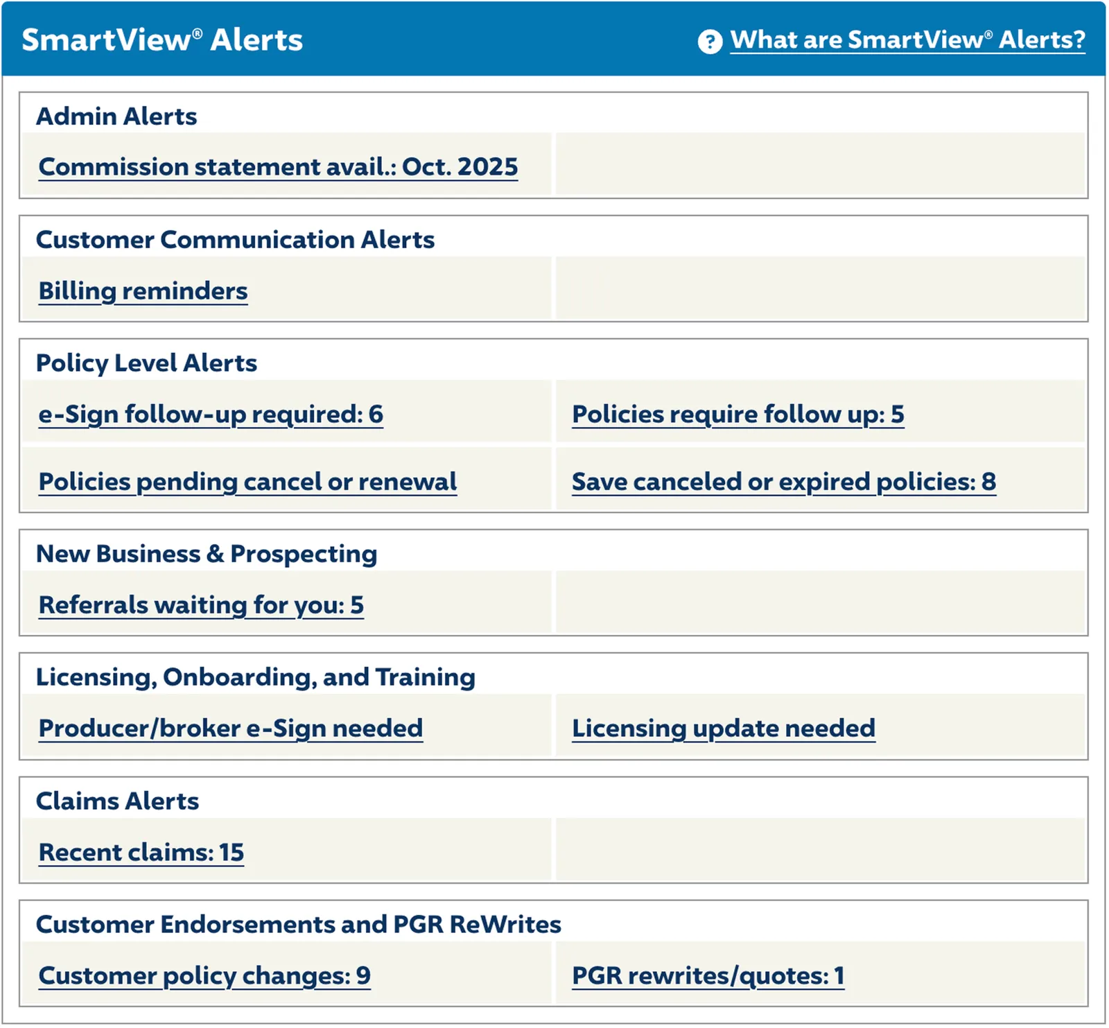
Agents relied on the SmartView Alerts dashboard to manage tasks, notifications, and time-sensitive work. The existing experience had become difficult to scan and harder to prioritize as content volume increased. Important tasks could get buried in cluttered layouts, making daily work slower and more frustrating.
Key Problems
- Poor information hierarchy
- Difficult to identify urgent tasks quickly
- High visual clutter
- Limited flexibility for different workflows
- Inefficient daily task management
The Goal
Improve the dashboard so agents could:
- Prioritize urgent work faster
- Scan information more efficiently
- Reduce cognitive load
- Personalize the experience to fit their workflow
- Complete daily tasks with less friction
The Solution
I helped redesign the alerts dashboard with clearer hierarchy, stronger prioritization cues, and more usable layout patterns. The new concepts focused on helping agents quickly understand what needed attention and act faster.
What Changed
- Improved visual hierarchy and readability
- Clear urgency indicators for time-sensitive work
- Cleaner layout with less clutter
- More flexible organization options
- Better support for real-world agent workflows
Design Process
Designed so nothing gets missed
I.
Understanding Daily Workflows
Reviewed how agents used the dashboard and where delays or confusion occurred during task management. This helped identify the biggest friction points around scanning and prioritization.
II.
Reworking Information Hierarchy
Reorganized content so the most important alerts surfaced first and secondary items became easier to manage.
III.
Designing Urgency Signals
Introduced stronger visual cues for priority items such as overdue work, expiring tasks, and actions requiring immediate attention.
IV.
Testing & Iteration
Multiple concepts were evaluated through usability testing and stakeholder review. Preferred directions consistently emphasized clarity, speed, and easier decision-making.
Before
After

Dashboard Before and After
Impact
Concepts were validated through usability testing and preferred by agents for clarity and speed. This project established the design foundation for future dashboard development.